- Регистрация
- 15 Февраль 2018
- Сообщения
- 15 555
- Лучшие ответы
- 0
- Реакции
- 0
- Баллы
- 1 295
Offline
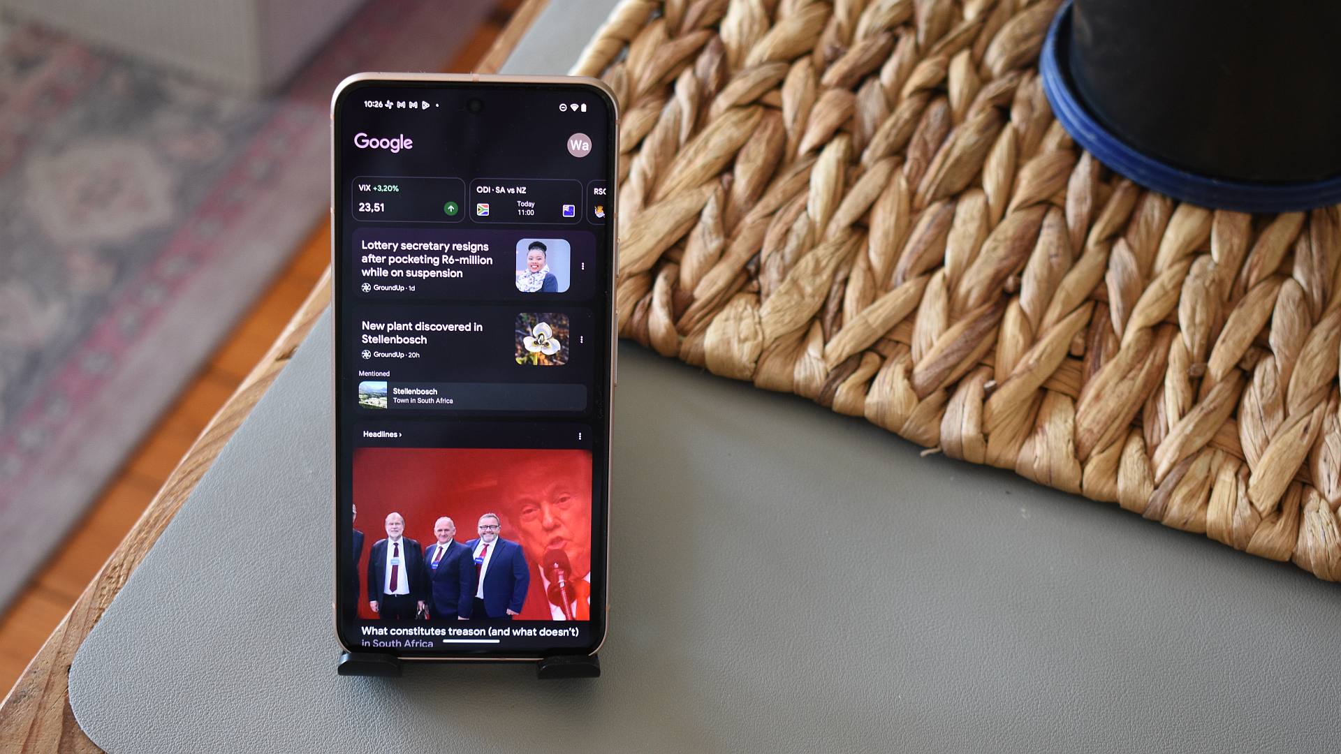
Credit: Andy Walker / Android Authority
- Google is rolling out a new full-width, zero-image margin layout for Google Discover on Android.
- This layout allegedly cuts off portions of the featured image and does not align with other recent Material Design 3 changes to Discover.
Many Android flagships have a minus-one screen (the pane on the left of your home screen) that houses Google Discover, a personalized content feed from Google that displays articles, videos, and other personalized content. It’s fair to presume that many people are accustomed to Discover’s look and feel, and any small change will be noticeable to both users and content publishers. Google is now testing a full-width layout for Google Discover, and it frankly spoils the aesthetic of the minus-one screen.
Previously, articles displayed on Google Discover would appear as cards with a featured image and a border. There would be plenty of margins on the left and right of the image, giving it a clean look thanks to the fairly used whitespace. However, as spotted by 9to5Google, Google is rolling out a zero-margin layout where the image spans the entire width of your display. Allegedly, in doing so, this layout also cuts off some portions of the image, compromising the context.